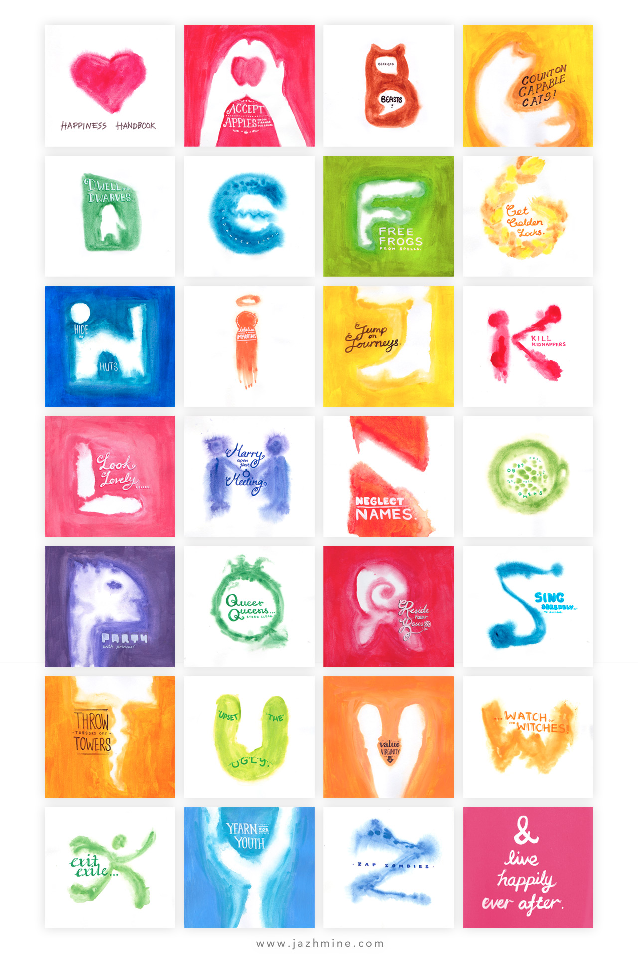
School project, Glasgow School of Art Singapore ( 2014 )
When I was reading the original fairy tales, I found them really bizarre and strange through my lens as an adult. Children might have found them okay but my mind was screaming at me to stop taking in the illogical stories with recurring themes. As such, I picked out key events that corresponded with alphabets and came up with the narrative copy that will drive each design.
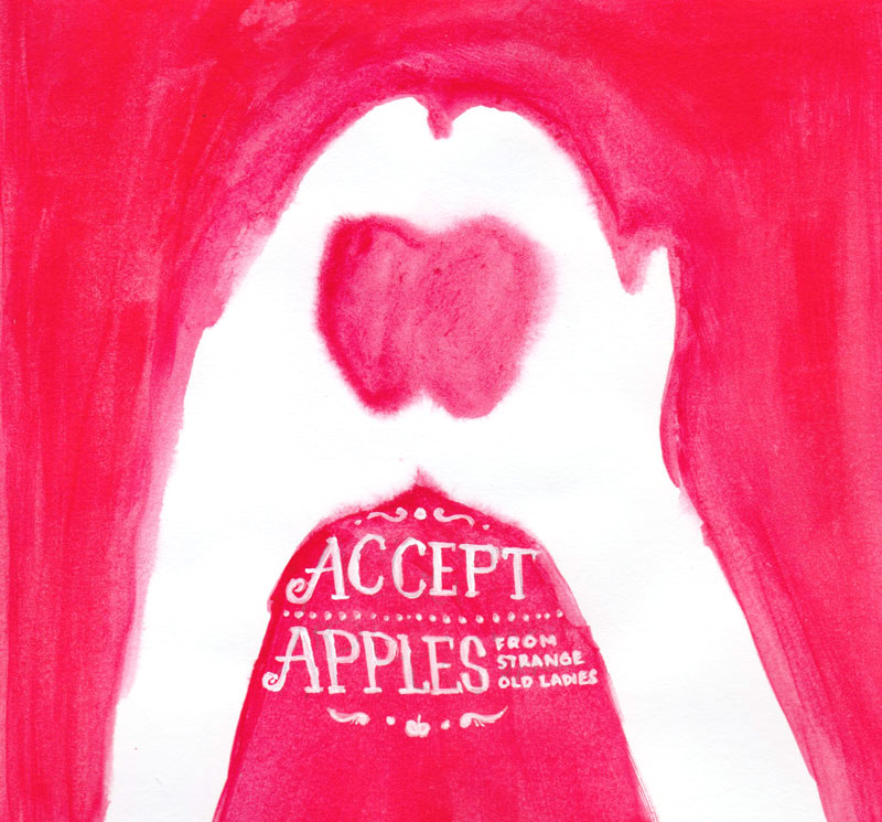

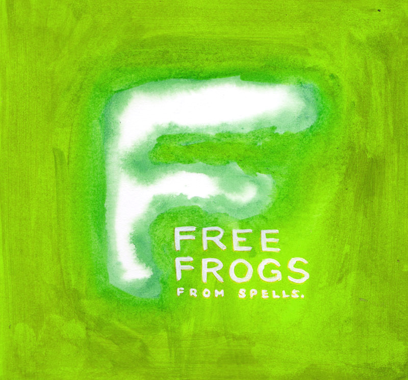
Going through the visual research I’ve done, I tapped upon new mark making skills I picked up from the use of watercolour in my previous projects into making my final piece. With not much time left, I sketched a little and experimented with water colours and acrylics. The effect was amazing when I painted water colour upon wet paper, the blotting and bleeding made for an interesting visual.
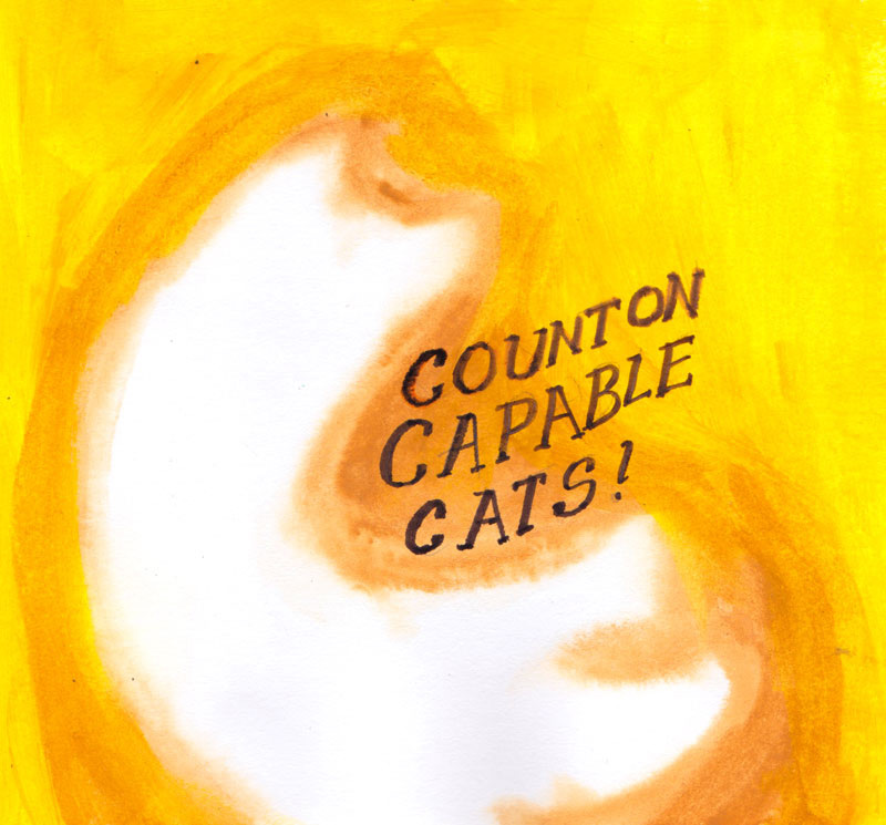
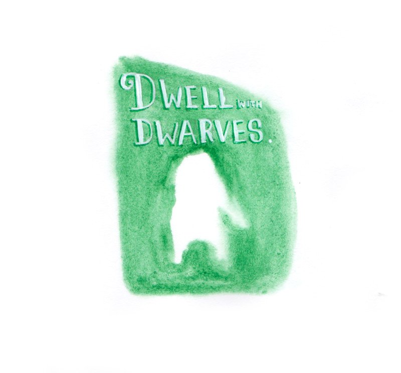
Titled “Happiness Handbook”, this alphabet book is largely based on the turning points and climax of fairy tales, which resulted in the “happily ever after” endings. Flipping through the book, viewers expect to see ways to attain happiness, however they are confronted with a vague image accompanied by hand-lettered text. By reading the text and interpreting the image, they would try to make a connection which might not make sense at that point in time. However, on the last page, “& live happily ever after.” seeks to make them reconnect what they have seen with fairy tales familiar to them and as such, they will realise the actual meanings of those alphabets and start to interpret the image in new ways.

If readers laugh or chuckle, or even start questioning their knowledge of existing stories when reading this book, then the objective would have been met. I found the whole production and experimenting experience liberating and fun. Even as I made the book by hand, I realised that I learnt so much more ditching concepts and working on something I’ve never done before.
